Color vernacular
At Acoufelt, continued investment in innovation and design ensures we remain ahead of the curve in the holistic acoustic product and services we offer. By partnering with key experts and design thought-leaders, we utilize this research to keep our finger on the pulse and stay abreast of new trends, new obstacles and new needs; to formulate real and thoughtful soundscaping solutions.
We use these resources to guide our own design and product outputs, and because we love sharing, we are super excited to offer some of these learnings to the wider design community.
Color analysis
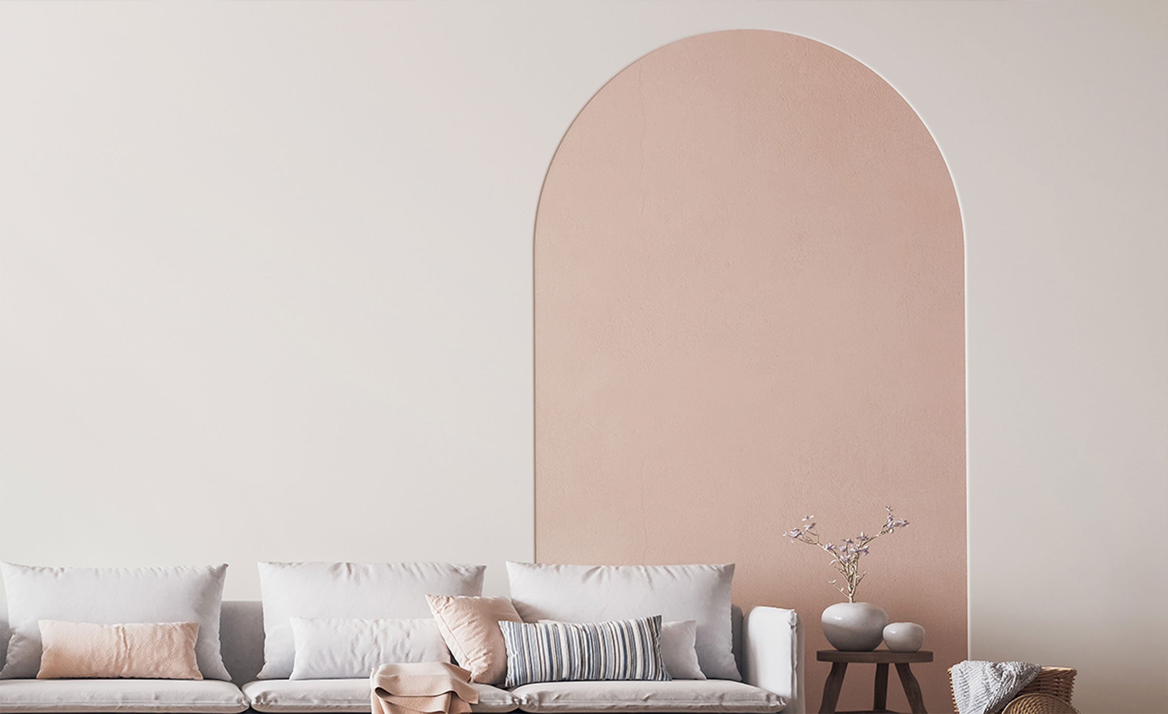
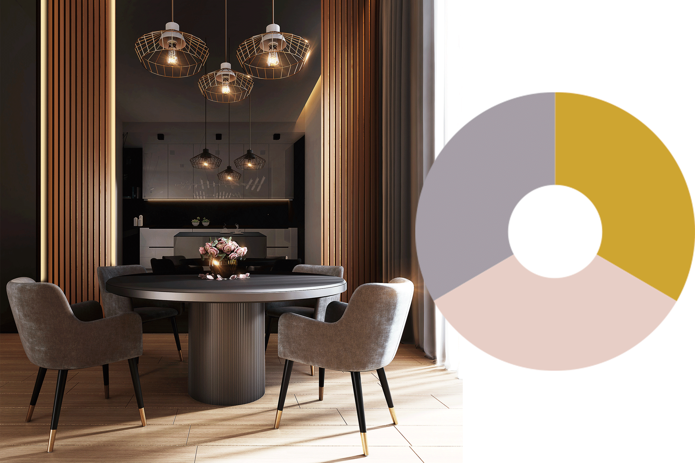
The ‘Vogue divinity’ palette is made up of rich pomegranate, muted deep browns, mauve, and gold with soft pastel pinks. Stripped back pales add an organic softness, derived from the natural tones found in shells and stone. Used together, these inspired mother of pearl tones have a calming feel. We see this palette being paired with hints of gold or flecks of ruby. Think draped curtains, mosaic floor tiles, huggable armchairs in rich greys, and marble side tables with splashes of gold.
Social commentary
After such a long period of time being forced indoors and constrained within borders, we step out with a newfound sense of confidence in the face of adversity. We step out wanting to celebrate the beauty of life, health and happiness, with the core of this thinking being a strong belief in the correlation between one’s health and happiness – both mentally and physically. Whilst we continue to observe the infiltration of ‘wellness culture’ into our lives, we see a new strain of thought emerging; a more connective nature that ties us to our confident self; bold and strong. Having gone so long without access to outputs and expressions of indulgence, luxury also plays a major part in the celebrations. This emphasis on nurturing our inner selves, combined with the desire to treat oneself with simple extravagance forms the basis of the ‘Vogue divinity’ color palette.
Color analysis
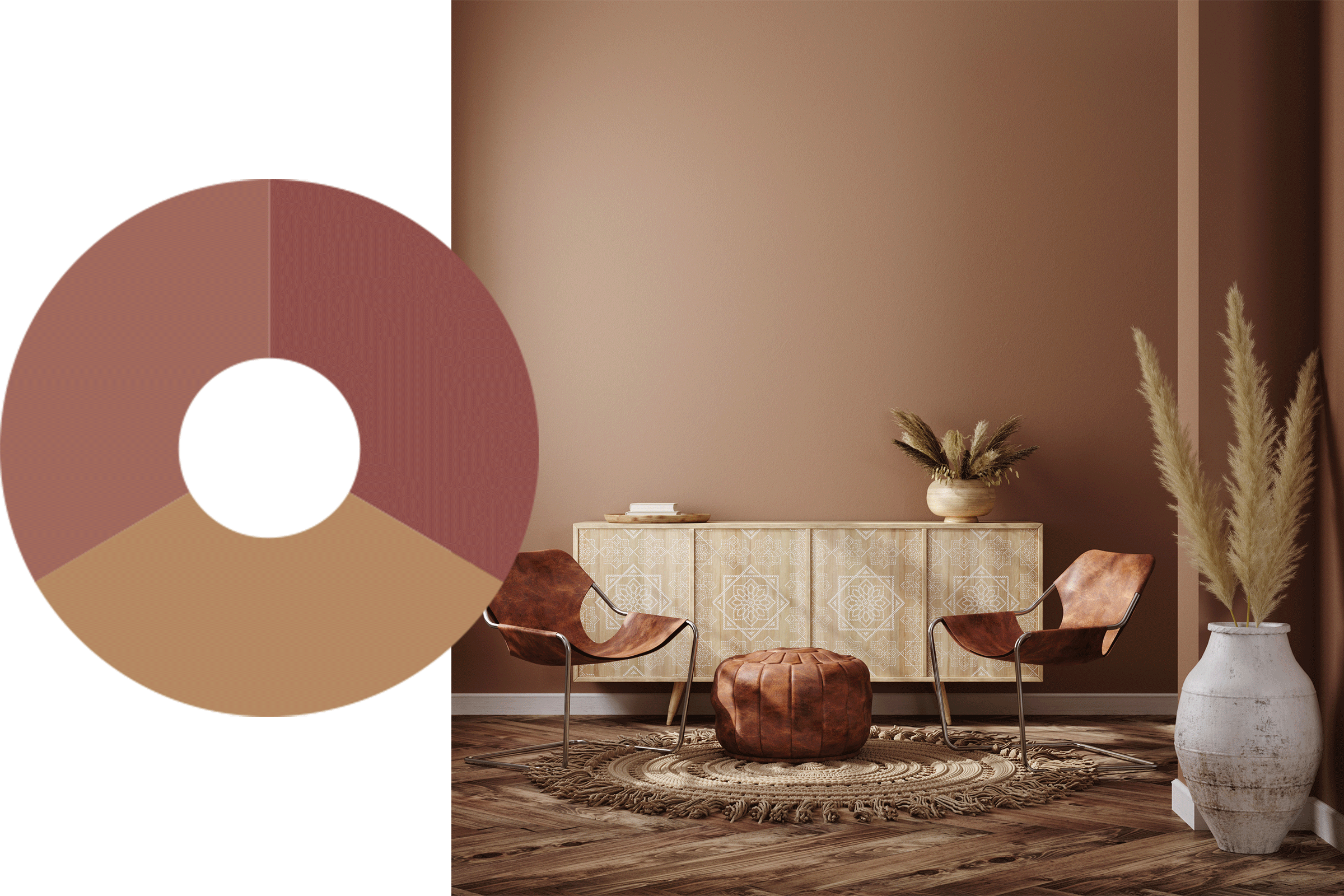
The earthy colors that make up the ‘Precious Earth’ palette are grounding, with tones reminiscent of ochre, rust, brown dirt and terracotta. Colors are familiar and harmonic.
Social commentary
As we experience firsthand our fragility to the forces of nature, protecting and preserving our planet is yet again at our forefront. Biophilic notions of color have been a trend in interiors for almost a decade now, but this palette focuses more on the psychology of color, and how we can connect at a rawer level. A respect and connection with mother nature and its wealth of diversity will see touches of earthy tones, reminiscent of seed pods, soil, warm sunlight, rural undertones. Colors that give you a big hug, reassuring us of our origins and connection to earth. We see a coinciding expression in the use of natural materials and textiles, think ratan and untamed leathers, contrasted with softer patterns of flora or fauna that will find itself across wallpapers and other accessories.
Color analysis
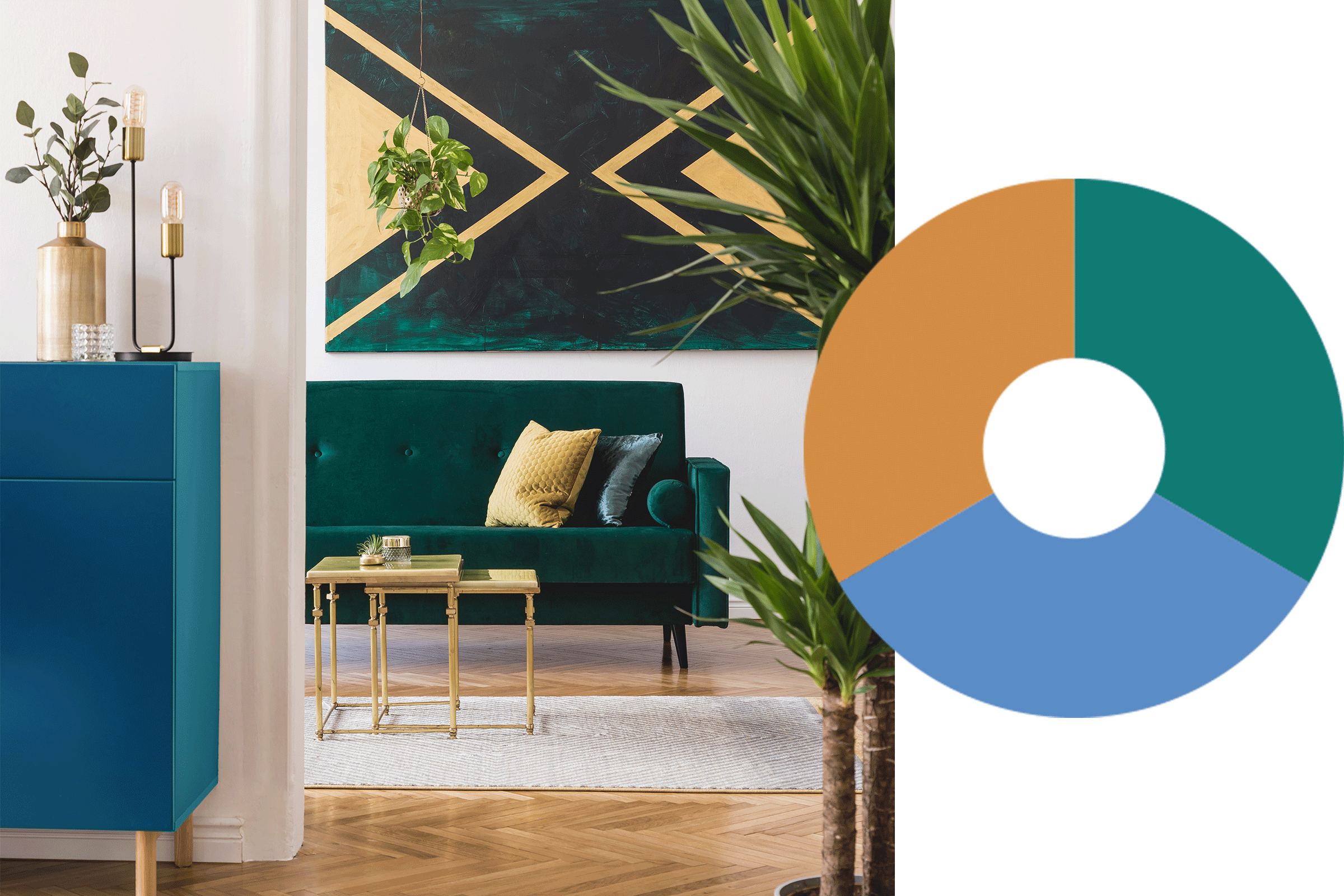
A contrast of mustards with complex teal blue tones form the basis of the ‘Retro chic’ palette, with sickly pinks, soft lavender and brown as secondary nuances. Warmer, mid-tone greens retain their importance and versatility in this palette, and this season also come to signify how mother nature prevails, providing a sense of positivity in more difficult times.
Social commentary
Through tough times we look to form nostalgic connections with previous, happier times, perhaps reflecting on our childhood and growing up. We conjure a retro past, filled with bold and bright primaries, but reimagined with a new softness. Hints of the 70’s emerge as we reminisce, with all the bold patterns to match. At face value these colors seem clashing and random, but when brought together with crosshatch patterns and paisley designs, they are cohesive. Whilst likely too bold for wall coverings and flooring, this palette will more so be seen peppered throughout interiors in the form of accessories and small furnishings, adding striking pops of individualism.
Social commentary
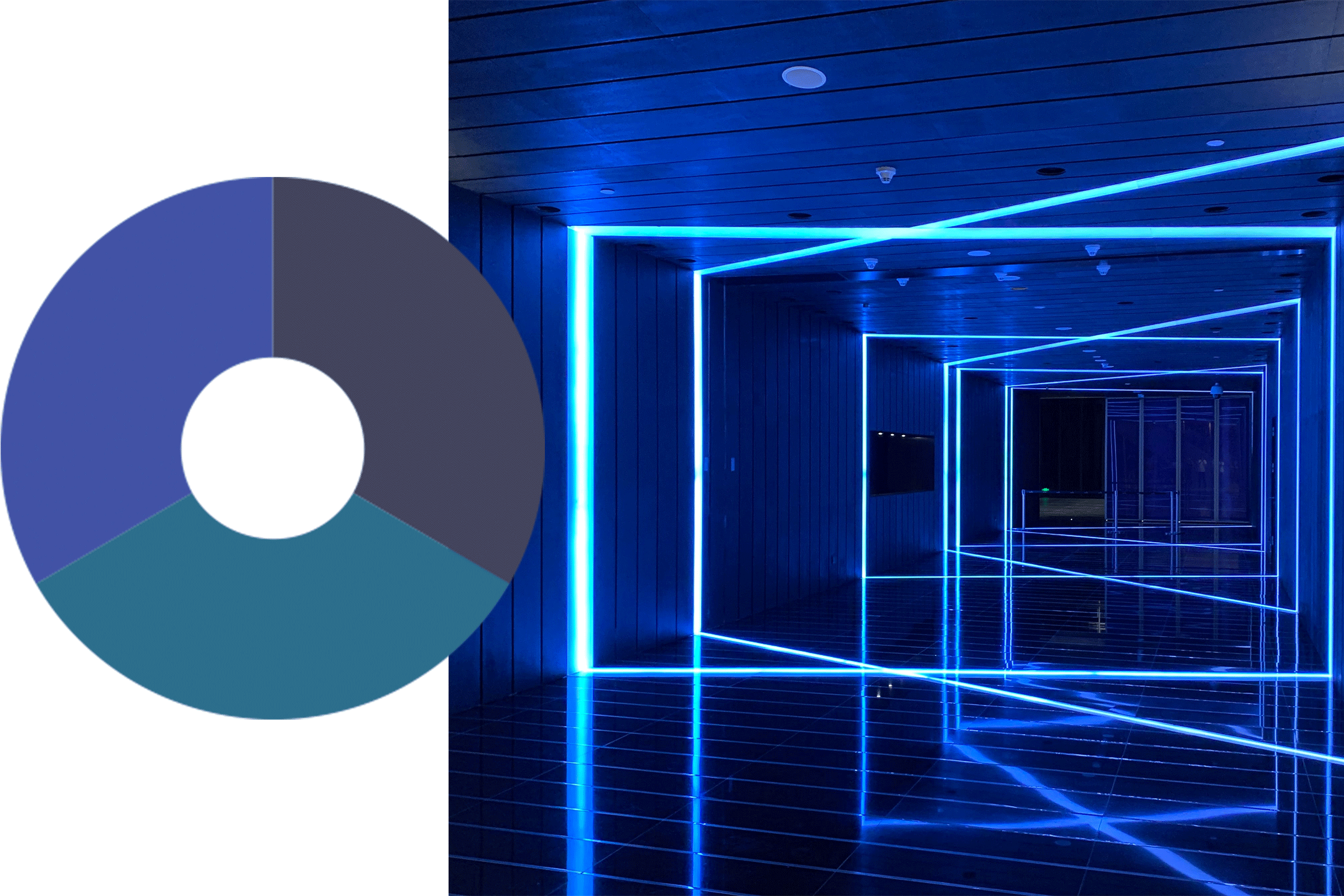
We are starting to pay more attention to our immediate surroundings, the spaces we live and work in. We relate to space more, having developed a more intimate relationship with it. Nature yet again influences the design of more intimate spaces. We look to bring the outside in, but in a different way to the more land-based palette of ‘Precious Earth’. Instead, we look to water and its soothing connection, both in color and texture. Water represents fluidity but also a sense of solidarity and certainty. Ultramarines and night sky blues interplay with concretes, steel and stone surfaces to soften the edges and help promote calm and concentration.
Color analysis
A continuation from Pantone’s 2021 color of the year, blues remain in this season’s palette but advance with greater saturation. The ‘Midnight tides’ color palette sees confident blues, coupled with cool greys and mineral hues with a touch of mint. Combinations work well for light and dark tonal combinations, providing a vivid accent against greyscale neutrals, yet also acting as the perfect backdrop to optimistic brights.
